Designing clearer digital healthcare experiences
Designing clearer digital healthcare experiences
Bachelor thesis · UX/UI Design · User Research · Interactive Prototyping
Bachelor thesis · UX/UI Design · User Research · Interactive Prototyping
Digital healthcare services give users greater access to care, but they also require people to navigate complex information and make important decisions in situations that may already feel stressful or uncertain.
For our bachelor thesis, we explored how interactive information design could make digital healthcare services clearer, easier to understand and more reassuring to use.
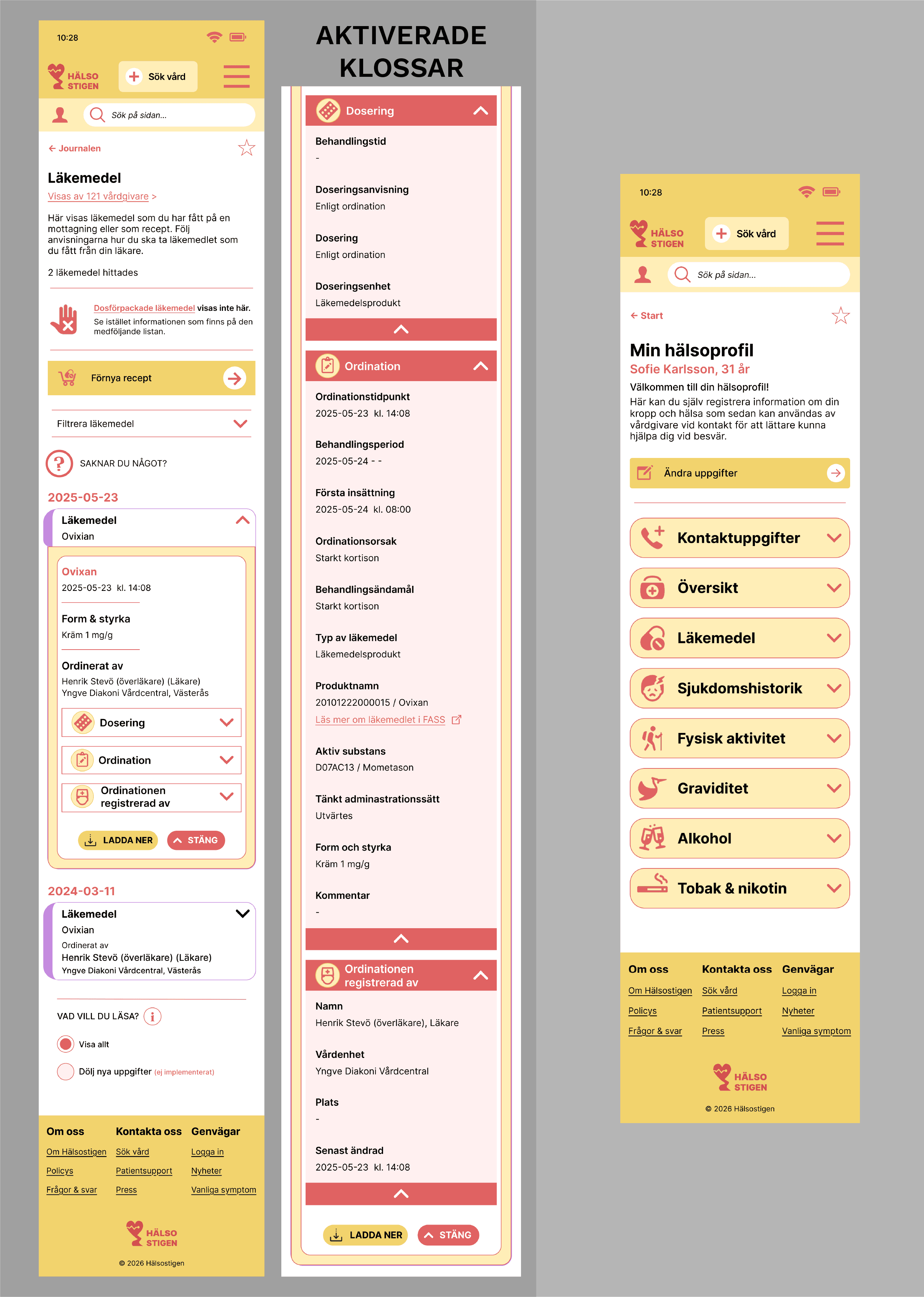
The project resulted in Hälsostigen, a high-fidelity mobile prototype combining healthcare information, medical records, digital contact tools and a personal health profile within one coherent experience.
My role
UX research, concept development, interaction design, UI design, prototyping and usability testing
Tools
Figma, FigJam and Google Forms
Deliverable
Interactive high-fidelity mobile prototype and bachelor thesis
The challenge
Digital healthcare platforms often contain large amounts of sensitive and complex information. Users need to understand where to go, what different functions mean and how to complete important tasks without becoming overwhelmed.
Our initial research showed recurring issues related to navigation, information structure, digital contact tools and the presentation of medical information. The challenge was therefore not to redesign one existing healthcare platform, but to explore how selected healthcare flows could be organised into a clearer and more coherent mobile experience.
Researching the current experience
We began with a mixed-method research phase combining a user survey, literature review and comparative analysis of existing digital healthcare services.
The survey received 113 responses and helped us identify recurring difficulties related to navigation, healthcare contact, fragmented services and the interpretation of complex medical information. We also analysed services such as 1177, Kry, Doktor24 and other healthcare platforms to understand common patterns, strengths and inconsistencies across the current landscape.
Key insights
Clear structure creates reassurance
Users felt more confident when information was grouped logically and the next action was easy to identify.
Mental models shape navigation
Users expected personal health information, medical records and related functions to appear together, even when the original structure placed them elsewhere.
Complex information needs progressive disclosure
Step-by-step flows and expandable content made healthcare information easier to scan without removing access to detail.
Defining the experience
Based on the research, we developed two personas and supporting scenarios representing different levels of digital confidence and healthcare experience. These were used to translate the research findings into concrete design requirements.
The main focus areas became information search, medical records, digital healthcare contact and a personal health profile. Rather than attempting to design an entire healthcare ecosystem, we concentrated on a set of connected flows where information architecture and interaction design could make a meaningful difference.
From sketches to prototype
We explored several structures and navigation models through sketches and wireframes before developing the final concept in Figma.
The prototype was designed as a unified healthcare service where users could search for reliable information, access their medical records, contact healthcare providers and manage personal health information. Consistent cards, visual hierarchy, familiar interaction patterns and progressive disclosure were used to reduce cognitive load and create continuity across the different sections.
From sketches to prototype
We conducted moderated usability tests using the think-aloud method. Participants completed realistic tasks involving information search, digital healthcare contact, medication information, medical records and personal health data.
The tests revealed that several interaction patterns were understood immediately, while other parts of the information architecture conflicted with users’ expectations. Participants particularly relied on familiar mental models when deciding where healthcare information should be located.
Iterating from user feedback
The findings were translated into a series of design revisions. We clarified the shortcut section, reconsidered the placement of the health profile, created a clearer separation between medication-related services and simplified the hamburger menu.
These changes improved the visual hierarchy and brought the structure closer to users’ expectations. The final prototype was therefore not only the result of our initial concept, but of an iterative process where observed behaviour directly influenced the interface.
The final solution
Hälsostigen is a high-fidelity mobile prototype that brings together healthcare information, medical records, contact tools and personal health data in one coherent interface.
The final design uses consistent navigation, clear visual hierarchy and step-by-step presentation to help users understand both where they are and what they can do next. The concept demonstrates how interactive information design can support clearer and more reassuring digital healthcare experiences without oversimplifying important information.